Between X-plore’s two panes runs a narrow strip of buttons — copy, move, delete, paste — and for most users it stays exactly as it shipped. That is a missed opportunity, because the operations you repeat fifty times a day should be the ones under your thumb. Learning to customize button bar icons quick actions xplore allows means shaping that strip around your actual habits: the archivist promotes ZIP, the network user promotes paste-to-LAN, the cleaner promotes delete and Disk Map.
The centre bar is X-plore’s command spine. Every file operation routes through it, and its buttons act on the active pane’s selection toward the inactive pane. Customising it does not add new powers; it removes friction from the powers you already have.
Customize Button Bar Icons Quick Actions Xplore Layout Principles
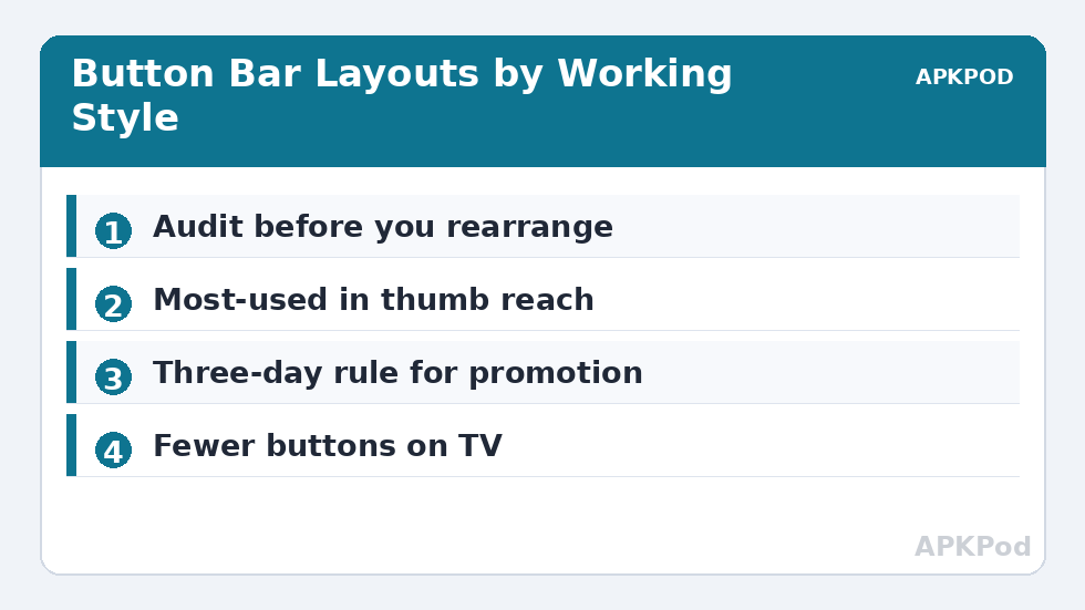
Begin with an honest audit. For one day, notice which buttons you actually press. Most people discover a brutally short list: Copy, Move, Paste-related actions, Delete, and New folder account for nearly everything, while other buttons gather dust. Your bar should be ordered by that reality, most-used in the most reachable position, remembering that on a tall phone the middle of the bar is the thumb’s home territory.
Depending on your X-plore version, button customisation lives in the Configuration screens or behind a long-press on the bar itself; newer builds expose appearance and toolbar options through the app’s settings, and the set of available quick actions you can surface includes operations like rename, properties, select all and archive creation. Where a specific action cannot be pinned, it remains one menu tap away — the goal is a faster 90 percent, not a perfect 100.
Pair button choices with the multi-selection system, because the bar’s meaning changes with context. With nothing selected the bar offers creation and paste; with a selection it offers the full operation set. The gestures that feed it are covered in our multi-selection gestures guide, and the two customisations compound: fast selection plus fast actions is the whole speed game.
Building Bars for Different Jobs
| Working style | Promote to the bar | Why |
|---|---|---|
| Photo offloader | Move, New folder, Properties | Date-stamped destinations and size checks dominate |
| Backup keeper | Copy, ZIP, Paste | Archive-and-store is the entire loop |
| Storage cleaner | Delete, Disk Map launch points, Properties | Find big, verify, remove |
| Network mover | Copy, Move, New folder | Panes pointed at shares all day |
| TV user | Copy, Move, Delete (large targets) | Remote navigation rewards few, big buttons |
The TV row deserves emphasis. On Android TV you navigate this bar with a D-pad, one deliberate step at a time, and every extra button is a tax on every operation. A stripped bar of four or five essentials transforms X-plore on a television from usable to pleasant. The same logic applies, softened, to small phones: density is not a virtue when each button is a mis-tap risk.
Do not forget the second customisation surface: the home screen. Actions you promote in the bar often deserve a matching doorway outside the app, which is exactly what home-screen shortcuts provide for the folders those actions serve. Inside speed plus outside speed is a system, and systems beat tips.
Reading the Bar: What Each Core Button Really Commits You To
Before rearranging anything, it pays to be precise about what the standard buttons promise. Copy is non-destructive and leaves the source untouched — the safe default when you are unsure. Move is copy plus delete-source, executed as one operation; it is the right tool for reorganisation and the wrong one when the source location is itself a backup. Delete in X-plore is immediate, with no recycle bin to forgive you, which is why it should sit where your thumb goes deliberately rather than accidentally. Properties is the quiet informant: sizes, dates and counts that turn guesses into verified operations before you commit to them.
New folder and New file are the creation pair — one builds destinations, the other builds the small citizens of the filesystem like .nomedia markers and notes. Paste-type actions close the loop for clipboard-style work across locations. None of these is glamorous; sequenced well by a customised bar, they are a production line.
One Bar, Two Hands, Three Contexts
Remember that the bar serves contexts beyond the file list. With an archive open, the relevant actions shift toward extraction; on a network pane, toward transfer. A bar customised purely for local tidy-up still serves those contexts adequately — the core verbs are universal — but if your days split between contexts, weight the bar toward the context you inhabit longest and let the others use the menu. Perfection per-context is not available; least-friction on average is, and it is enough.
There is also the matter of the bar’s neighbours: the pane tabs and the path display. Customisation thinking should include them — a visible full path prevents the classic error of operating in a same-named folder one level off, an error no button arrangement can undo. Speed is a system property; the bar is its busiest intersection, not its entirety.
If you share the device — a family tablet, a work phone — resist over-personalising. A bar tuned to one person’s reflexes is a trap for everyone else, and the defaults exist as a shared language. Personal devices get personal bars; shared devices get standard ones, and the distinction is a courtesy worth keeping.
Adopt a simple test for every candidate promotion: the three-day rule. An action earns the bar only if you used it on three separate days, not thirty times in one exceptional afternoon. Projects spike; habits persist. Review the bar against the rule quarterly and it quietly tracks your real work instead of your most dramatic week. Conversely, demote without sentimentality: a button untouched for a month is taking a prime seat from the actions you actually perform, and demotion is not deletion — the menu keeps everything a tap further away, which is exactly where monthly actions belong.
Bottleneck:
Tip:
All figures are estimates under good local conditions — strong signal, no competing traffic, both devices on the same network. Real speeds drop with distance, walls, channel congestion and slow storage on either device. Protocol options (SMB, FTP, SFTP) assume a 5 GHz-class Wi-Fi link.
Restraint, and When to Reset
Two failure modes stalk the customiser. The first is promoting everything, recreating the menu inside the bar at twice the clutter. The second is over-fitting to this week’s project, then suffering the layout for a year. Revisit the bar when your work changes character — a new NAS, a new phone, a new job — and treat the default arrangement as a respectable fallback, not a failure state.
If the bar ever confuses you more than it helps, step back to defaults for a week. Muscle memory is the actual feature here; a bar that matches your habits disappears from conscious thought, and one that fights them never does. That philosophy — interface shaped by repetition, verified by use — runs through the whole Dual-Pane Tips collection, from the tree settings to the gesture system.
Frequently Asked Questions
What is the button bar in X-plore?
It is the strip of operation buttons between the two panes. Its buttons — copy, move, delete and others — act on the active pane’s selection toward the folder open in the other pane.
Can I change which quick actions appear on the bar?
Depending on version, toolbar and appearance options in X-plore’s settings let you influence which actions are surfaced and how the interface is arranged. Actions that cannot be pinned remain available through the menu.
Which buttons should I prioritise?
Prioritise by your own repetition: for most people copy, move, delete, paste and new folder dominate. Put the most-used actions in the most reachable positions.
Does a simpler bar help on Android TV?
Yes. D-pad navigation pays for every extra button on every operation, so a short bar of essentials makes X-plore on TV noticeably faster to drive.
I made a mess of my layout. How do I recover?
Return the appearance and toolbar options to their defaults in settings and live with them for a few days. Rebuild only the one or two promotions you genuinely missed.